Proteus Digital Health: Brand development and product launch
Proteus Digital Health is a silicon valley technology company looking to transform healthcare through an entirely new category of pharmaceuticals called Digital Medicines. This completely unique product consists of a tiny ingestible sensor that, when combined with medication, can be tracked by a wearable patch. This technology allows the company to develop apps that can be used by patients to see whether they are taking their medication correctly.
Proteus Discover uses this technology to help patients with type 2 diabetes, high blood pressure or hepatitis C better manage their daily medication taking — conditions that when not treated properly can lead to serious complications.
As a category defining product, building trust was of paramount importance for the Proteus Discover brand. The visual identity is clean, reassuring and medical. Everything we created was underpinned by inclusive design principles, ensuring our typography, colour pallet and graphic devices were legible enough to meet the accessibility standards demanded by an FDA approved medical device.
Case study: Introducing Proteus Discover
Brief
The technology behind Proteus Discover is so novel that doctors and nurses struggled to explain to patients what it is, how it works, and what value it brings. Lengthy set up appointments were needed to answer patient questions and get them started on the programme. To relieve this burden, a website was create to:
show the value of the product and encourage patients to register
reassure patients that it’s safe and secure
set the correct mental model about how it works in order to avoid confusion in later use
Process
As the design lead on this project I managed the creation of this site from conception through to final delivery. This involved:
working with the user research team to develop and test value propositions and messaging
working with product and service design teams to plan how the site sits within the patient journey
working with a copywriter to develop content
working with film makers and animators to create video content
developing how the brand is expressed online
creating design iterations and working with the user research team to evaluate solutions
creating specs and working with developers to realise the build of the site
Outcome
The launch of the website allowed clinical sites to do patient outreach over phone or email. Therefore reaching a larger number of patients and increasing enrolment. By allowing patients to register at home in their own time, the site also reduces the number of clinic visits for patients.
Case study: Patient set up
Brief
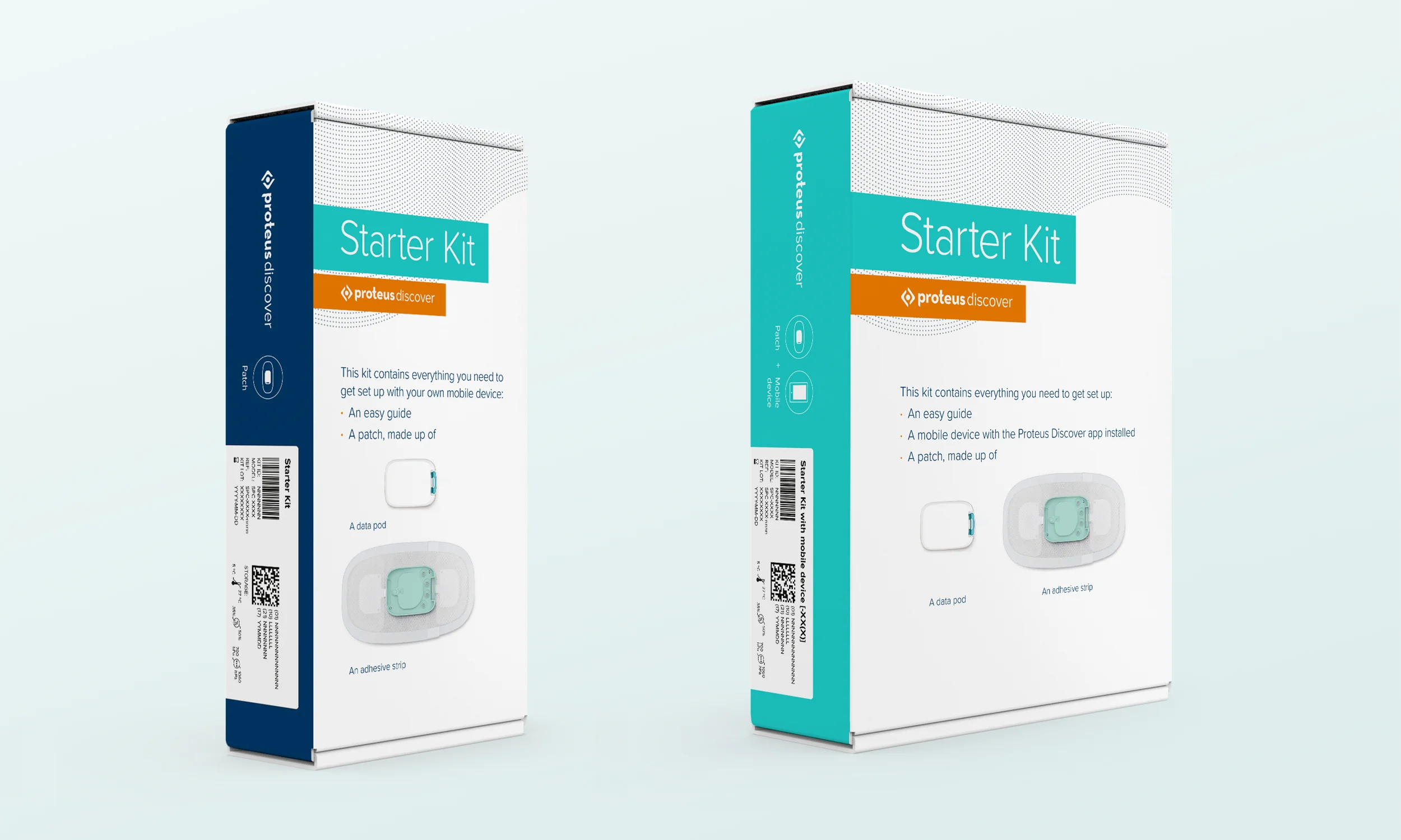
Proteus Discover was initially launched at low volumes with a handful of clinical sites. Individual parts were shipped directly to clinics, where nurses helped patients get set up. In order to make the product commercially viable at scale, we needed a kit that could be supplied through a mail order pharmacy, that patients could use to get set up on their own.
Process
As the design lead on this project, I was responsible for:
working closely with the product manager to gather requirements from multiple stakeholders and driving alignment on priorities
translating requirements into a clear design brief
collaborating with product designers Tone Design to develop concepts for the physical form of the kit
developing effective quick start guides and ensuring a smooth transition from the physical to digital experience
developing how the brand identity is applied to packaging
working closely with the user research team to conduct usability studies
working with packaging supplier to deliver the final product
Outcome
Having previously tested numerous configurations of kits and quick start guides, our final usability study showed the highest level of success in set up from any user testing to date. As a result we were confident that we could launch with a design solution that would help get patients set up without confusion.
We established that paper instructions should focus on getting patients into the app and overcome basic problems which were surfaced in user testing, such as trouble finding the on/off button on the iPad, and confusion about where to look for the app.


